an·ti·dote ˈant-i-ˌdōt : a remedy to counteract the effects of poison
I believe good design is an antidote to life’s challenges, uplifting our lives through objects, spaces and sensory experiences. This blog is a place to share my inspirations, insights, creativity, craft, and view of this beautiful evolving world.

Palm Springs
After a wedding in the desert this weekend, I stole an hour to indulge in one of my guilty pleasures: shooting images that capture a unique sense of place.
Most people’s vacation albums are full of images of friends, family, & famous landmarks. Mine are a collection of details most people don’t even notice: architectural details, typography, way finding, signage, textures, landscapes, & color palettes. I’ve been building my souvenir library of placemaking images for decades. I’m obsessed with documenting the elements that build each location’s unique identity. I love how each combination of images creates an emotional profile, a visual story that reflects my experiences.
Palm Springs evokes a sense of swingy, mid-century modern optimism and freedom. Historically, it was a popular get away for celebrities due to its proximity to LA — old Hollywood contracts had stipulations that actors remain within 2-hours of studios when in production. Their presence built an elevated yet playful mystique that is still present today. It’s a living museum of MCM homes that are meticulously maintained. Art, design, and culture are just embedded in Palm Springs’ DNA.
So what was I able to collect in one hour to convey this desert haven’s essence?
1) Color

The natural light in the desert is crisp and clear, giving color the perfect stage for the bright, cheerful colors associated with this western city. Mid-century tones of mint green, mustard, flamingo pink, sunset orange and aqua that would be kitschy or garish elsewhere feel happy and welcoming here. They’re colors that could feel overly dated but here they still manage to feel fresh and current. Almost classic. They just work.
2) Typography

As a graphic designer, I have a special affinity for typography. Signage has always been one of my favorite things to hone in on. The different fonts and the way they’re composed for roadside recognition is incredibly powerful. Each location shows trends that subtly dot the landscape, giving it a unique voice. In Palm Springs, there’s a real penchant for playful, casual script typefaces that give off a relaxed resort feeling. Even the more modern san serif treatments have personality. Helvetica would feel uptight in this environment.
3) Patterns

While iconic mid-century modern homes are the undeniable star of the show, the patterns achieved in brick around them are key elements to creating that MCM effect. They’re everywhere in endless variation, reminiscent of the playful forms from Rae Eames and Alexander Girard. They provide a sense of depth and rhythm to the simple, minimal lines of the modern architecture they adorn. I kept wondering where they were sourced, and if there are still local vendors producing this dazzling array of styles. Is it difficult to replace vintage ones when they get damaged?
4) Textures

The California desert is a study in harsh extremes where only the toughest survive — stone, sand, cactus, blacktop. Palm Springs is a man-made mirage — a lush mix of tropical palm trees, manicured lawns and golf courses, and coiffed boxwood hedges. The dramatic contrast between the natural and built environments has created a unique sense of place, different than other western desert towns.
5) Sky
I can’t close without acknowledging the one constant in Palm Springs - the glorious blue sky. Dominating the landscape, its a dramatic lead character that reduces even mountains to supporting characters. In most urban landscapes, our view of the sky is obstructed by deciduous trees and evergreens so that we often don’t even notice it. But in the desert, you just can’t miss its presence. It lifts your spirits — the perfect backdrop for a playful escape. It’s a critical component to the Palm Springs experience.

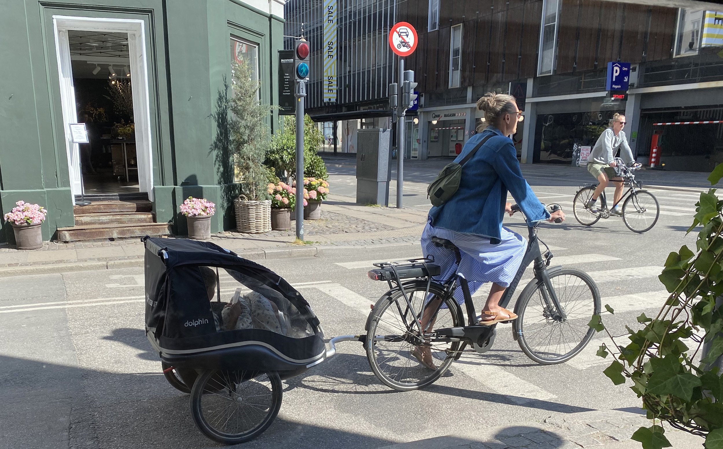
Copenhagen
Copenhagen was the first stop on a Scandinavian trip I took last year. As a design mecca, I expected it to be a visual feast. But it was so much more.


I filled my museum well with visits to the 3 Days of Design conference exhibits, Designmuseum Denmark and The Louisiana Museum of Modern Art. I got drunk on classic modern furniture juxtaposed against classic architecture, a visual history of Danish design and an afternoon in a glorious sculpture park. Of course the food was great and the historical sections were charming. Don’t get me started on the amazing public transportation.
But the thing I loved most about Copenhagen was wandering. Wandering is my favorite way to discover the things that give a location its unique sense of place. I happily filled hours documenting the design details around me: typography on signs, architectural carvings, building numbers, pavement textures, even manhole covers filled up my photo feed. On this trip I captured unique color stories for future pattern design palettes. These images become my favorite souvenirs.
It was my first trip to Copenhagen, but definitely not my last.


